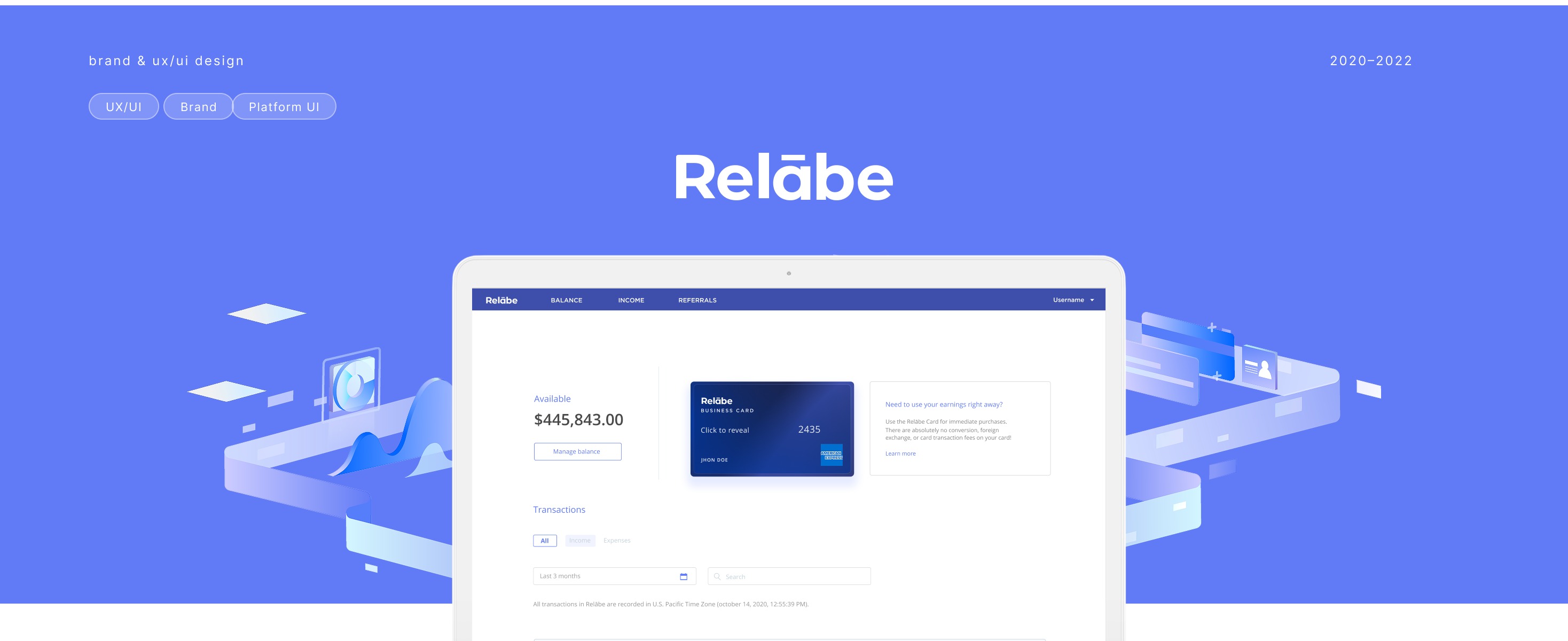
Relabe is a digital platform where publishers can sell their ad revenue and get paid instantly — turning pending earnings into immediate cash flow.
The challenge was to create Sulvo's sister brand: a payment system born from the same platform but built to stand on its own. Relabe needed to feel familiar enough to earn Sulvo publishers' trust, yet distinct enough to exist as an independent product.
01 — Brand
Starting from Sulvo's visual DNA, I developed a brand language for Relabe that shared structural DNA — the grid, the typeface approach, the confidence — while introducing a distinct blue-dominant palette and a softer, more approachable tone. Where Sulvo felt technical and authoritative, Relabe needed to feel trusted and immediate.
The wordmark uses a customized letterform with a macron over the "a" — a subtle typographic detail that gives the name a premium, fintech-grade feel without overdesigning it.
02 — Color & Typography
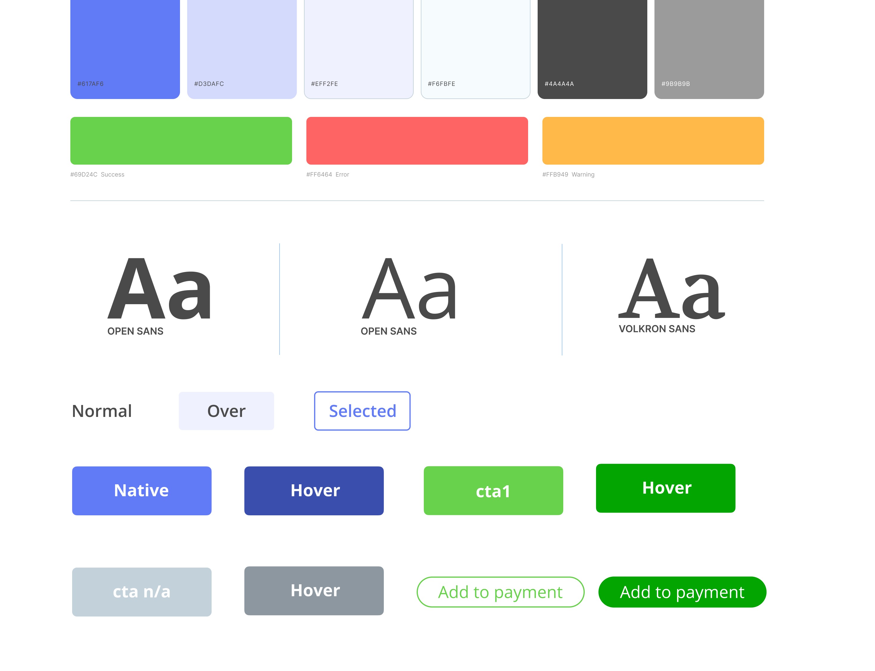
The primary palette is anchored by a strong cobalt blue, complemented by light blue-greys and high-contrast dark tones. Secondary colors — green, orange, and yellow — serve functional roles across the UI: success states, warnings, and pending statuses.
Typography uses a geometric sans-serif at multiple weights. The pairing of thin display sizes with bold UI labels creates a clear hierarchy across both the marketing site and the platform.
03 — Components
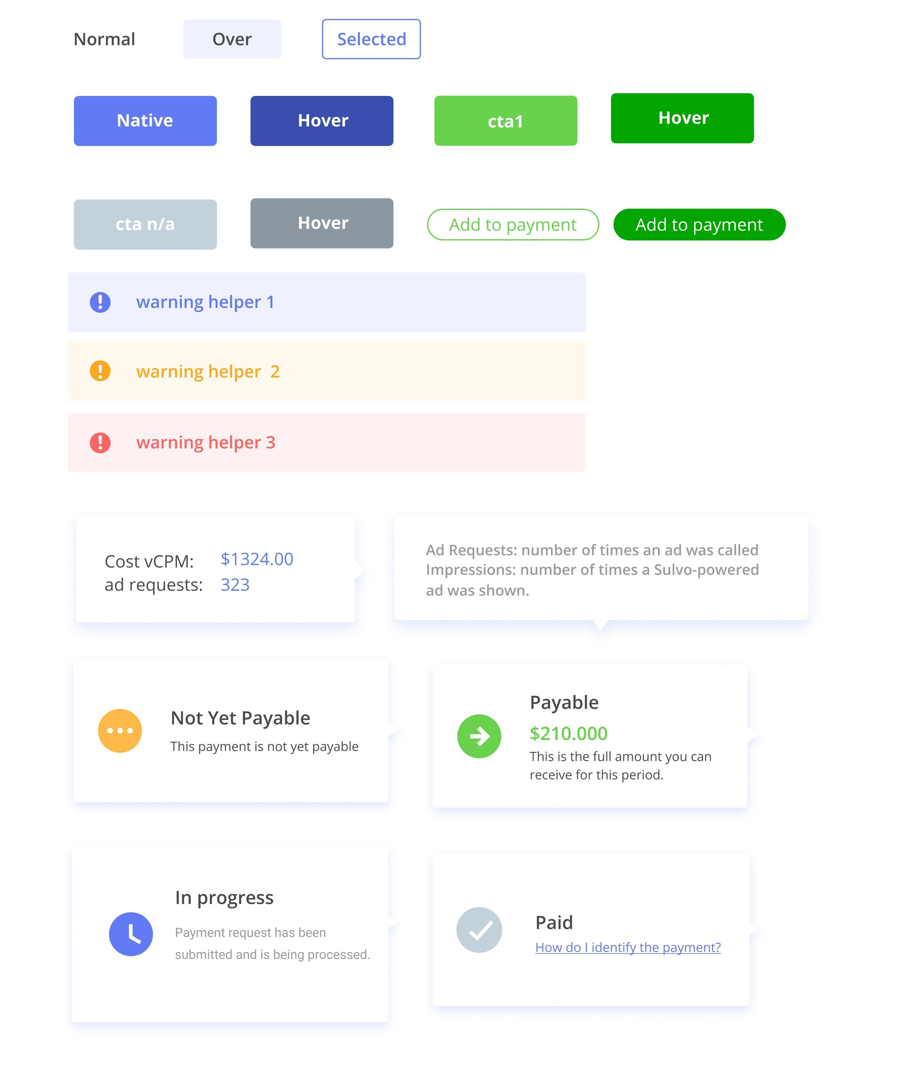
The component library covers the full spectrum of states the platform needs: buttons, inputs, warning banners, invoice status cards, and payment flows. Each component is designed to communicate financial status clearly — in-progress, paid, not yet payable — so users always know where they stand without reading fine print.
04 — Illustration System
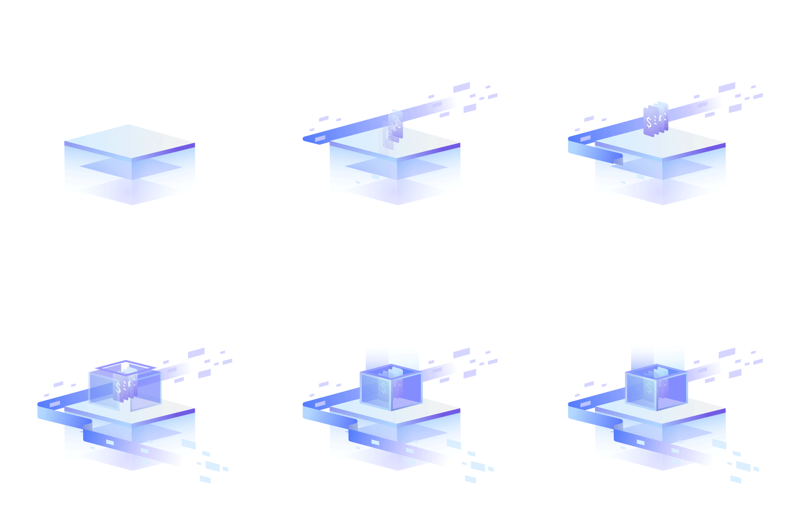
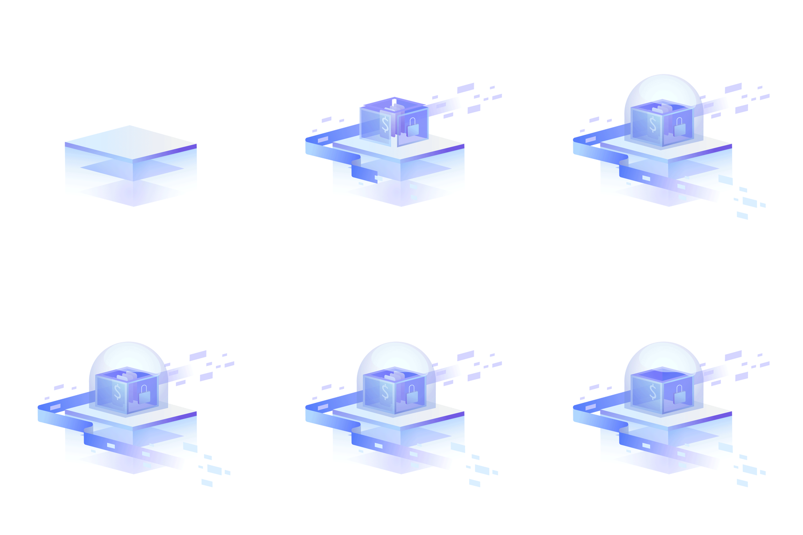
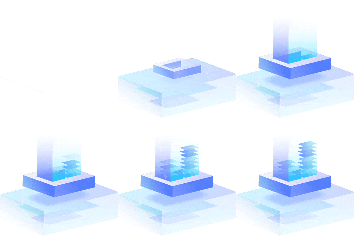
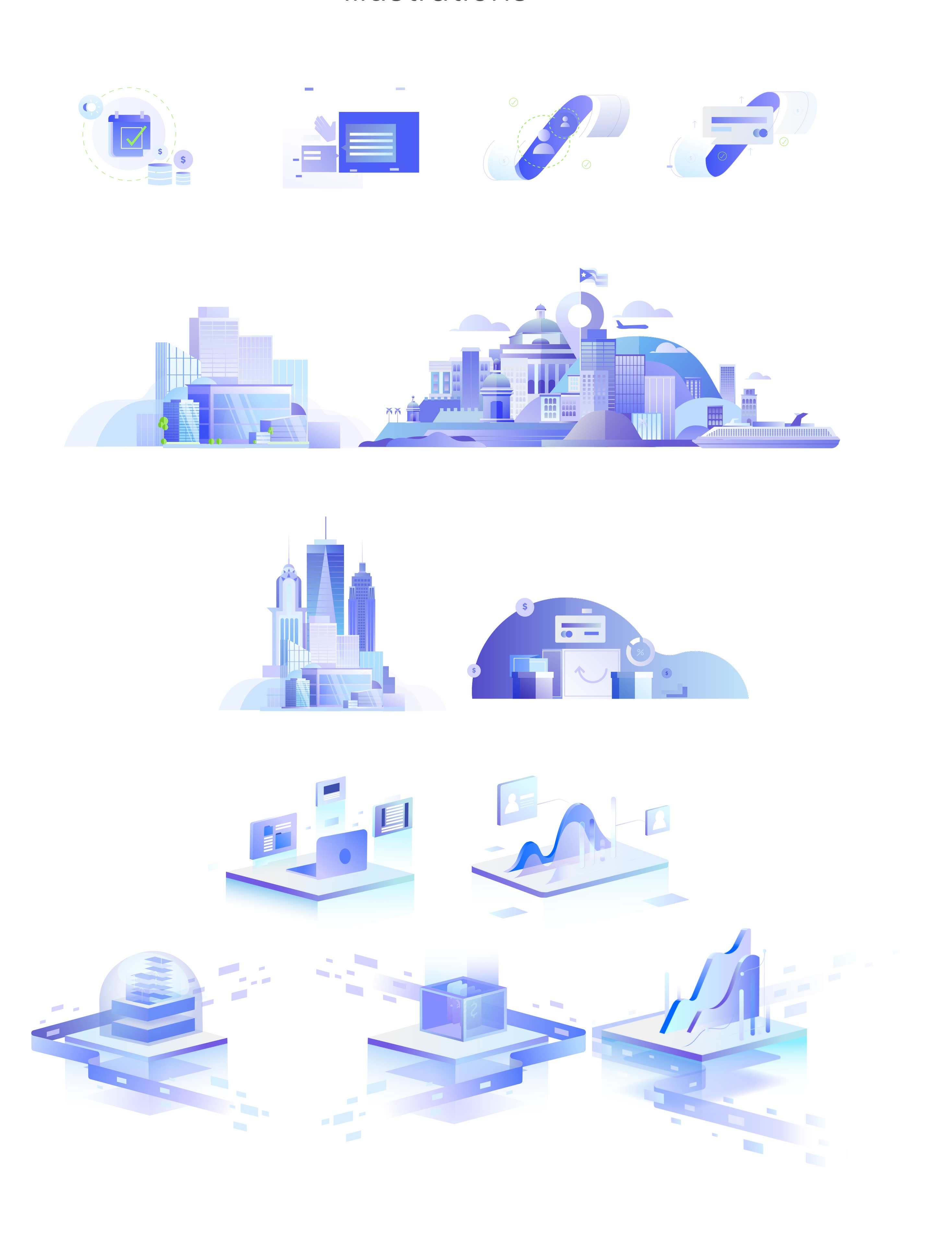
To give the platform warmth and visual personality, I developed a library of isometric 3D illustrations. The style references architectural and urban environments — cities, buildings, infrastructure — as a metaphor for the publishing ecosystem Relabe operates within. The soft blue-purple palette ties directly back to the brand, keeping illustrations feeling native rather than generic.
05 — Motion Graphics
Key brand moments use animated isometric 3D graphics — looping compositions that bring the illustration system to life across the website and platform. Each animation follows the same visual language: translucent geometry, soft blue-purple gradients, and smooth easing that feels considered rather than decorative.