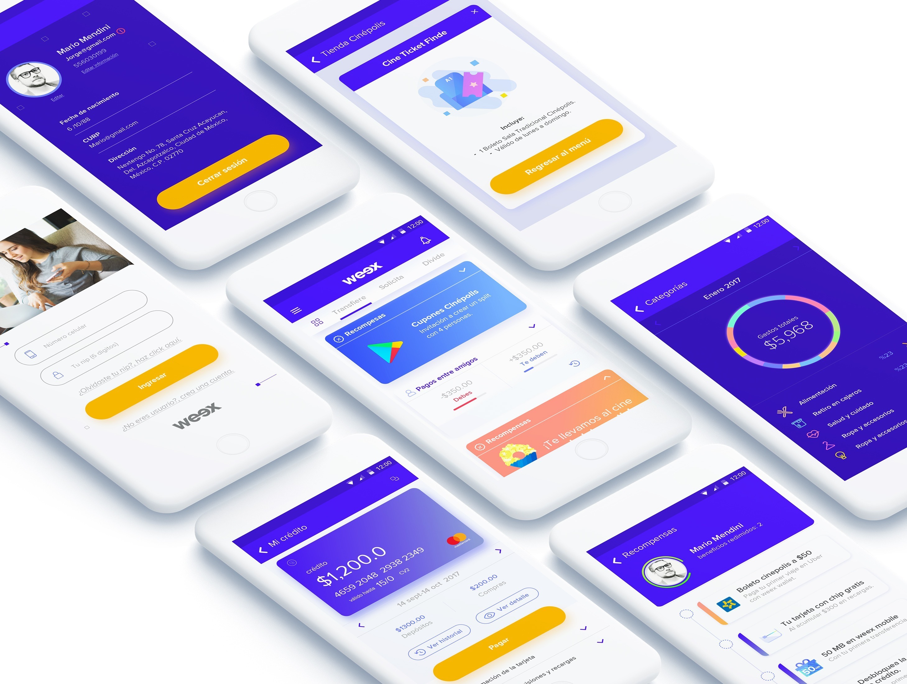
Weex Wallet is a financial management app for young people — combining social payments, expense tracking, card management, and credit tools in a single mobile experience. The product bridges the gap between physical card and digital financial life.
The design system covered the full product: visual guidelines, component library, iconography, illustration style, and final screen designs across the core user flows.
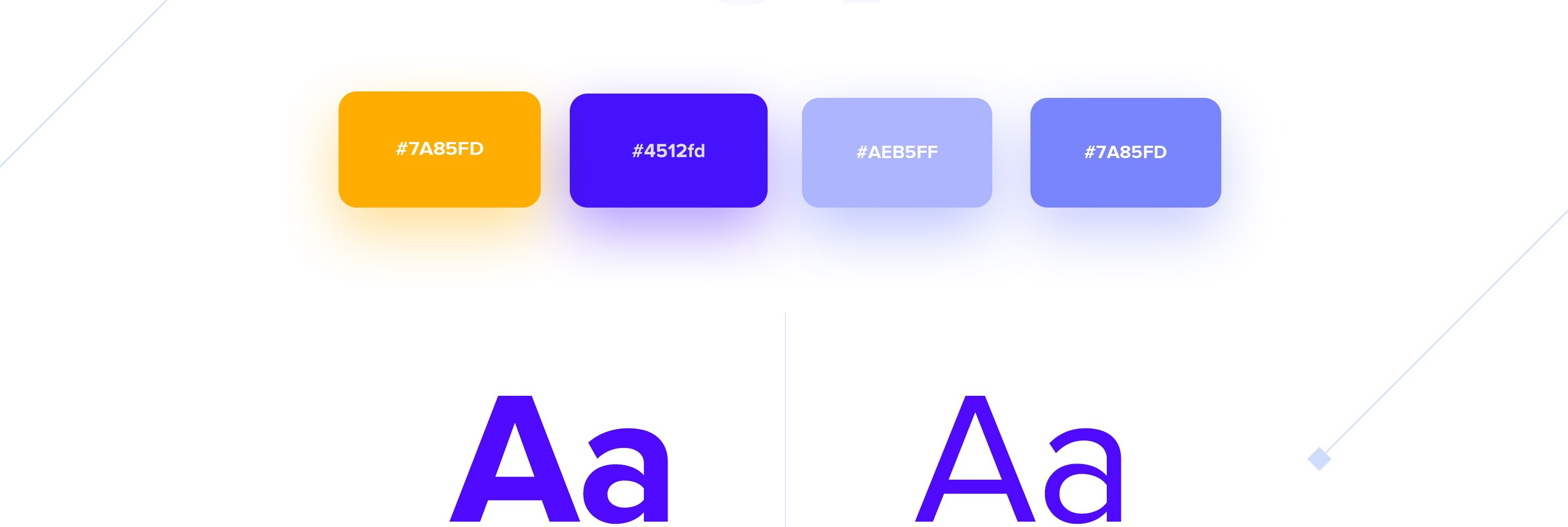
01 — Visual Guidelines
The visual language is built around a vibrant purple and warm orange palette — energetic and youthful, without feeling frivolous. Two type weights carry the hierarchy across screens, keeping the UI light and readable at small sizes.
02 — User Experience
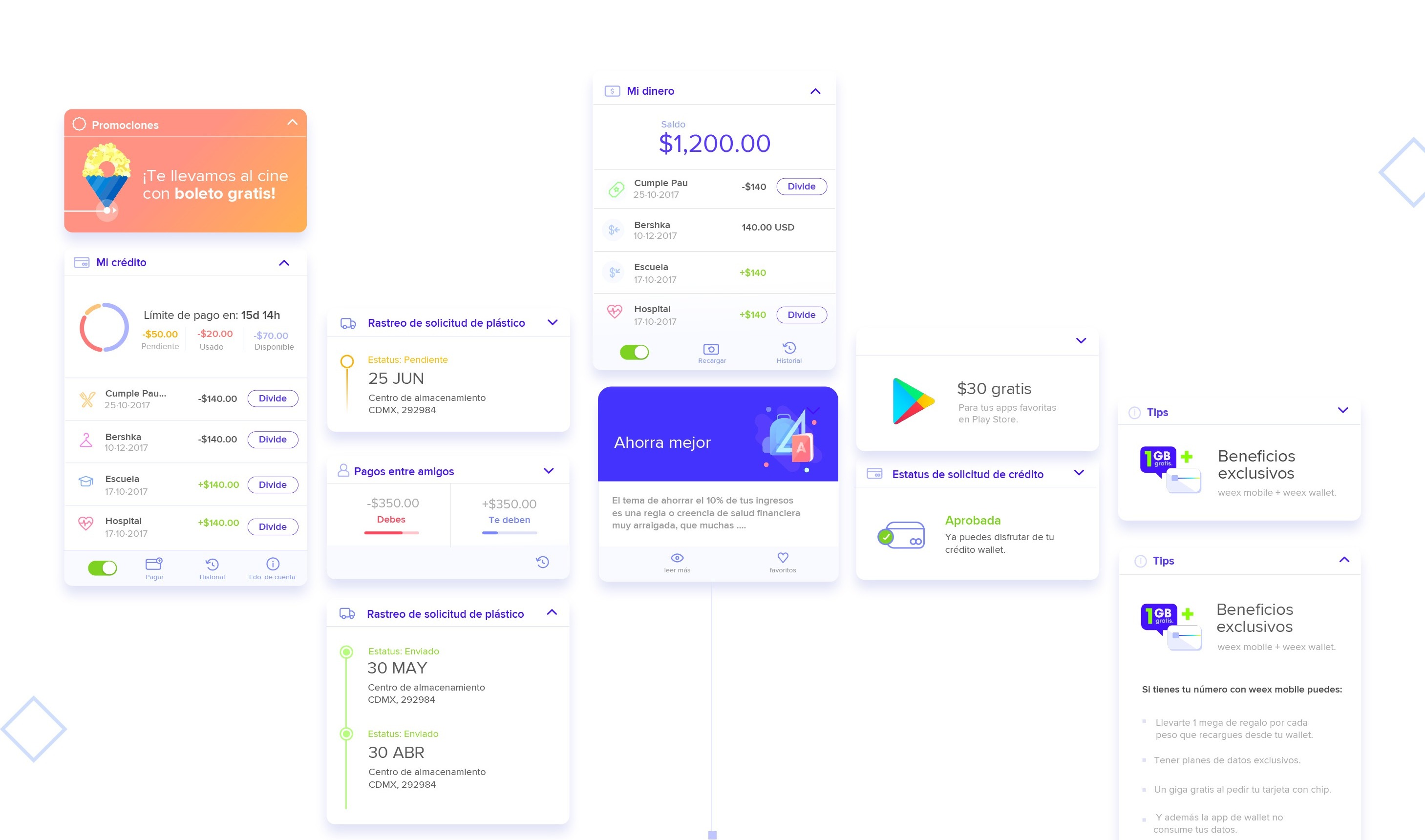
I was brought in to give personality to an existing card system and bring the Weex Wallet brand on board. The challenge was designing a component where each card held stacked information but still gave users a clean, at-a-glance summary of what it contained.
The information hierarchy prioritizes what users check most — their balance and last transactions — while keeping the full feature set one tap away.
03 — Main Features
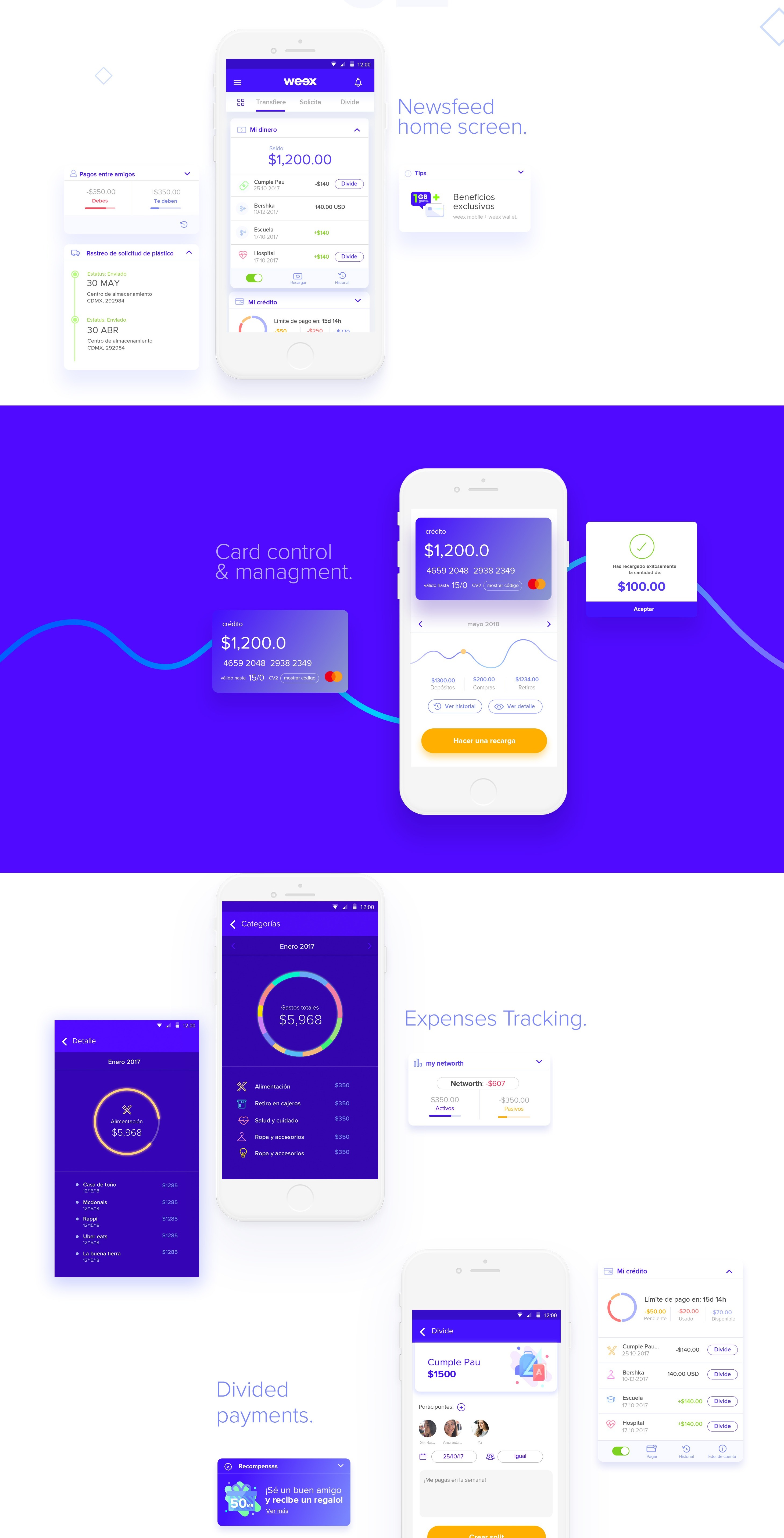
Card management gives users full control over their physical and virtual cards — freeze, limits, transaction history. Expense tracking turns raw transaction data into categorized spending insights, helping young users understand where their money actually goes.
04 — Iconography
A custom icon set designed across two registers: category icons for merchant types and navigation icons for the main dashboard. Consistent stroke weight and corner radius keep the system cohesive at every size.

05 — Illustration Style
A library of soft 3D illustrations brings personality to empty states, onboarding, and feature introductions. The style is playful but structured — each illustration maps to a spending category or product concept, reinforcing the visual system across the full product.

06 — Showcase
The complete set of production screens across the core flows — from onboarding and home to card management and expense tracking.