Case Study
Sulvo is an advertising technology platform for publishers, built on patented technology. The brand needed to communicate that distinctiveness visually, not just through language, but through a design language that felt invented rather than assembled.
01 · Brief
The challenge was to build a brand system for a patented advertising technology platform that needed to communicate exclusivity, technical precision, and innovation. The website was the primary touchpoint. It had to carry the brand while also functioning as a product marketing vehicle for a technical audience.
We needed a visual language that felt like it came from the inside of an invention. Something that signaled intellectual ownership without relying on generic tech clichés.
02 · Ideation
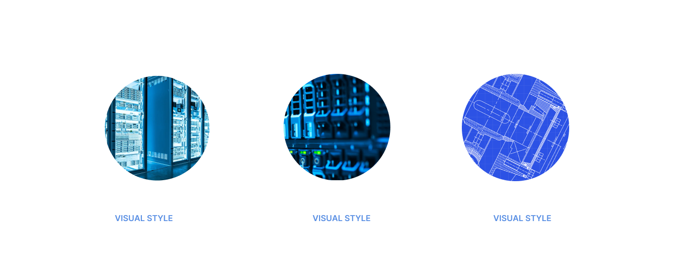
The ideation phase started with one question: what does a patent look like as a brand? We explored technical drawing conventions, engineering blueprints, and industrial schematics, not as decoration, but as the foundational visual grammar. Early concepts moved between flat line art and dimensional 3D forms before landing on the combination that felt right: isometric geometry rendered in blueprint blue, suggesting both innovation and precision.
Sulvo's patent was at the core of the brand's identity. The design language needed to communicate that this was something proprietary, engineered, and exclusively theirs. Generic branding wouldn't do it. We needed a visual system that felt like it came from the inside of an invention.
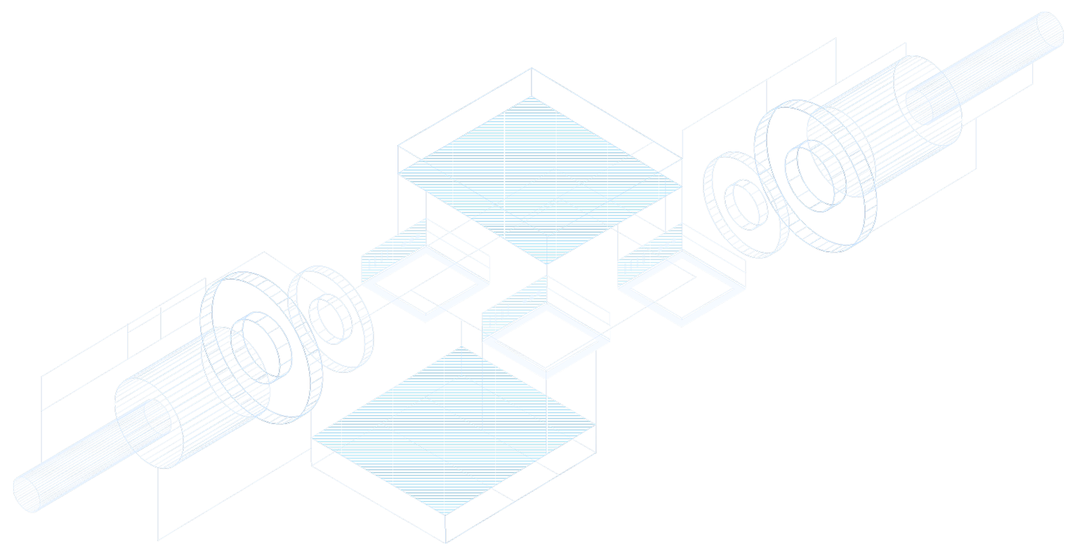
The answer was a blueprint aesthetic: technical line work, isometric 3D geometry, and the precision of engineering documentation, reinterpreted as brand expression. The result positions Sulvo not just as a software product, but as a protected, original piece of intellectual infrastructure.
03 · Color & Typography
The palette is anchored in deep navy and electric blue: technical, precise, and unmistakably digital. The lighter blues extend the system into UI contexts and illustration without losing cohesion. Typography uses a clean geometric sans-serif across three weights, letting the visual elements carry the personality.
04 · Illustration System
The illustration system extends the blueprint concept into two registers: a flat line icon set for UI and documentation contexts, and a library of isometric 3D scenes for marketing and hero visuals. Both share the same geometry and palette, creating a coherent visual world across every surface.


05 · Website
The website brought every piece together: the blueprint backgrounds in the hero, the isometric illustrations next to each product message, and the blue palette carrying the whole page. It was the first place publishers met the brand, so it had to feel as engineered as the technology behind it.
Scrolling through the Sulvo website